VenueScanner
Maximising conversions with improved user experience
Service
Product Design
Role
Sole UX/UI Designer

Background
In 2024, I had the opportunity to redesign the 'Mark as Booked' feature for VenueScanner, with the goal of increasing host utilisation. The project focused on making this feature more visible and user-friendly to encourage more hosts to mark their spaces as booked.
Background
In 2024, I had the opportunity to redesign the 'Mark as Booked' feature for VenueScanner, with the goal of increasing host utilisation. The project focused on making this feature more visible and user-friendly to encourage more hosts to mark their spaces as booked.
Background
In 2024, I had the opportunity to redesign the 'Mark as Booked' feature for VenueScanner, with the goal of increasing host utilisation. The project focused on making this feature more visible and user-friendly to encourage more hosts to mark their spaces as booked.
Challenges
The main challenges included increasing the visibility of the 'Mark as Booked' feature, simplifying the booking process, and ensuring the interface was intuitive and engaging for users.
A unique challenge for this task, was that I was unable to do any user research, a commercial decision had been made to improve this feature, so I was asked to ideate, design and ship the product for testing in a live environment.
Business goals
Increase the use of the 'Mark as Booked' feature.
Improve overall booking efficiency.
Enhance user satisfaction to drive repeat use.
Business goals
Increase the use of the 'Mark as Booked' feature.
Improve overall booking efficiency.
Enhance user satisfaction to drive repeat use.
Business goals
Increase the use of the 'Mark as Booked' feature.
Improve overall booking efficiency.
Enhance user satisfaction to drive repeat use.

Usability review
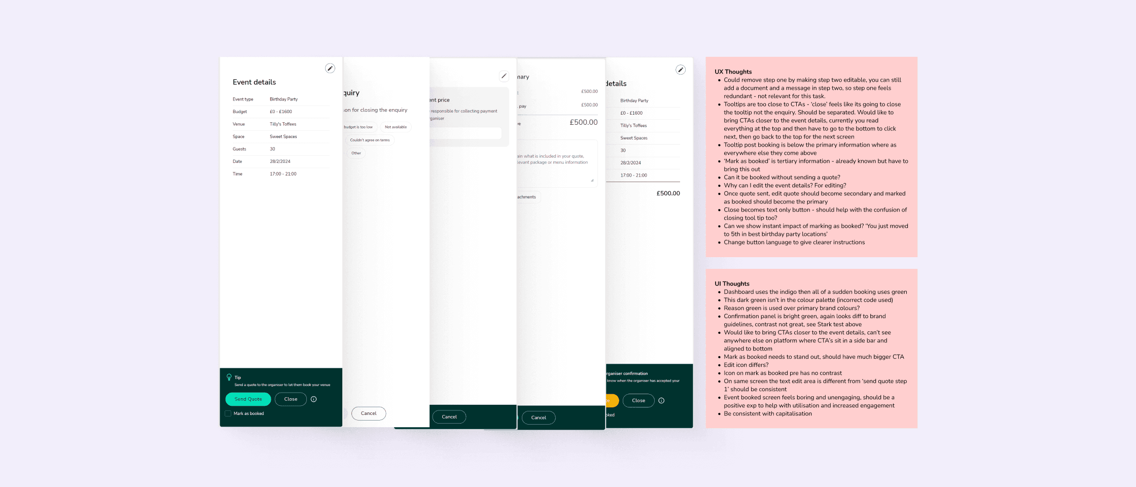
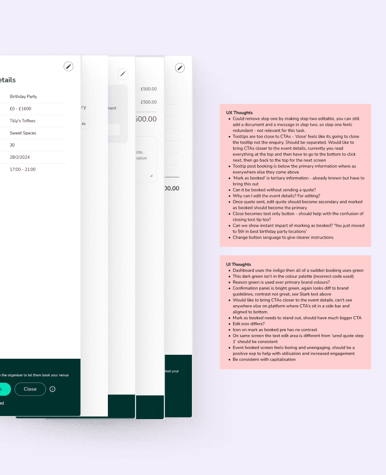
During my evaluation of the VenueScanner platform, I identified several key usability issues. The booking process includes redundant steps that could be streamlined by making step two editable, removing the need for the first step. Tooltips are too close to CTAs, causing confusion, and should be separated, with CTAs positioned closer to event details for better accessibility. The 'Mark as Booked' action needs to be more prominent, ideally becoming the primary action after sending a quote, and should provide immediate feedback to enhance user engagement.
Furthermore, the platform's colour palette and tone of voice should be consistent with the brand's primary colours and use clear, specific instructions. CTAs and icons must be uniformly designed and positioned, and the event booked screen should be more engaging and offer a 'wow' moment to encourage user interaction.
User flows
Following the usability review I created user flows of the existing experience and improved the flow based on the idea that fit with business and user goals.
User flows
Following the usability review I created user flows of the existing experience and improved the flow based on the idea that fit with business and user goals.
User flows
Following the usability review I created user flows of the existing experience and improved the flow based on the idea that fit with business and user goals.
Design
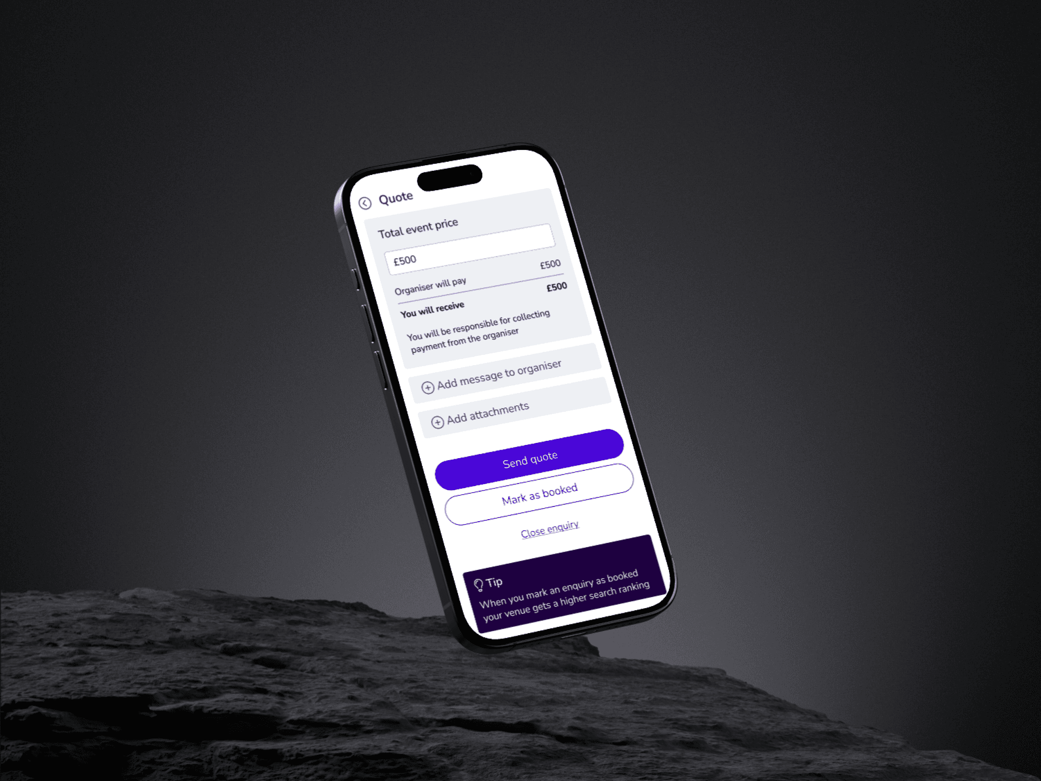
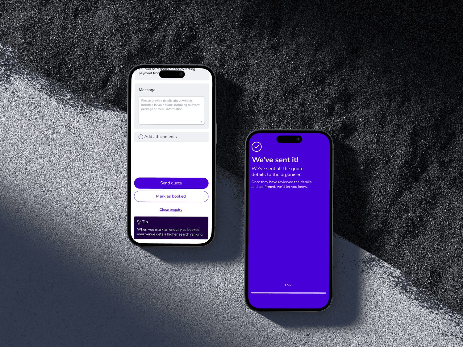
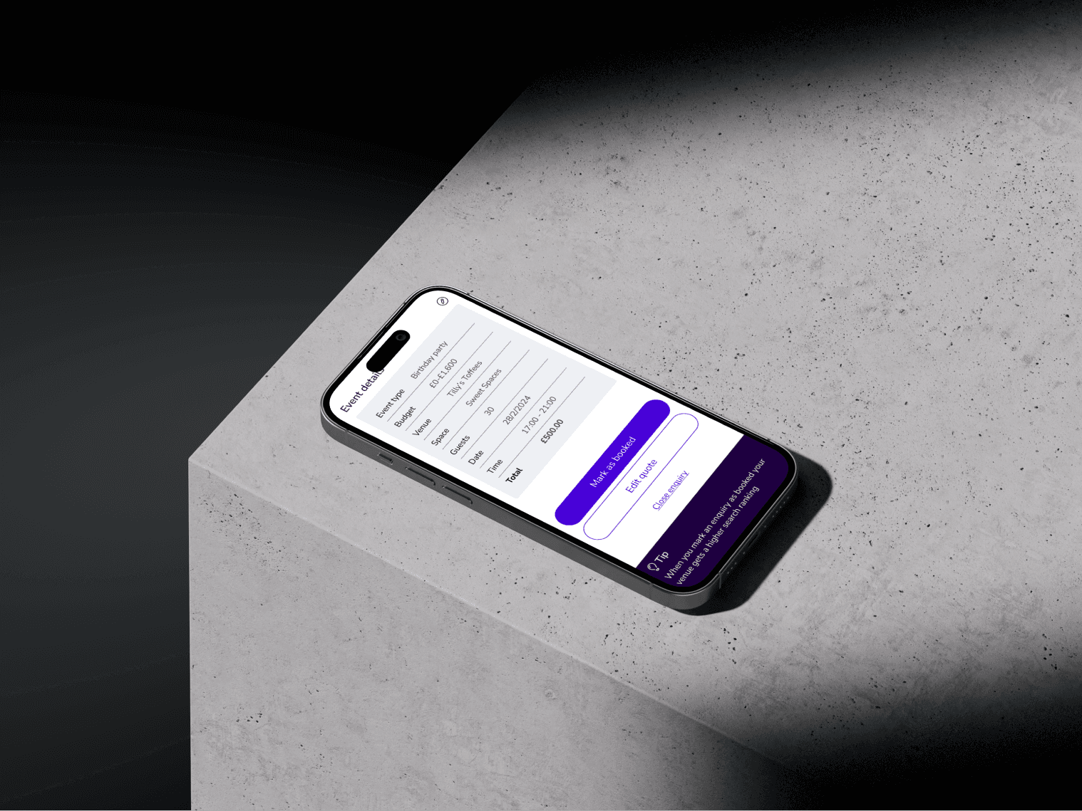
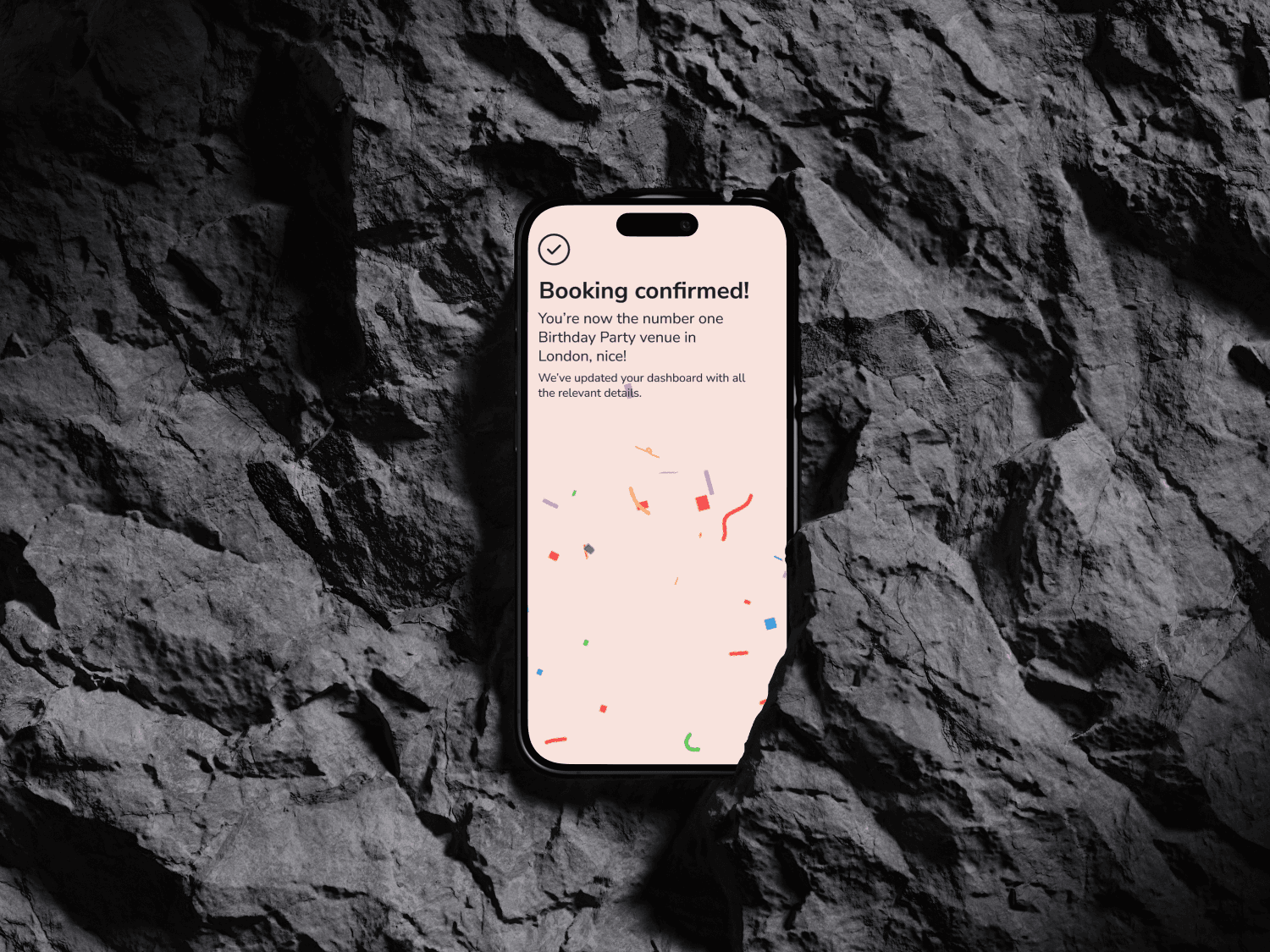
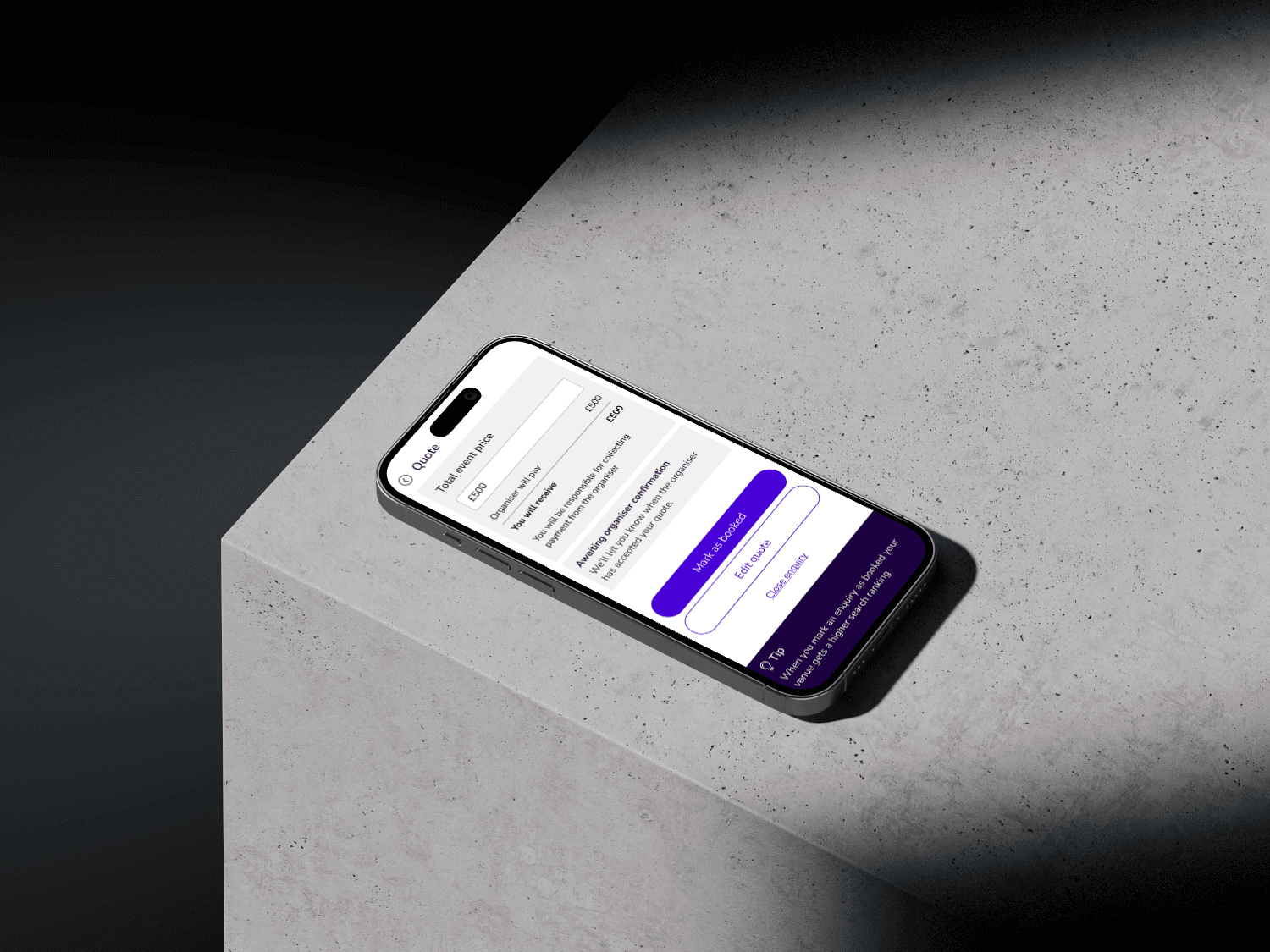
Developed a clean, intuitive UI that aligns with VenueScanner's brand. Emphasised key actions with primary brand colours and streamlined the user flow to reduce clicks.
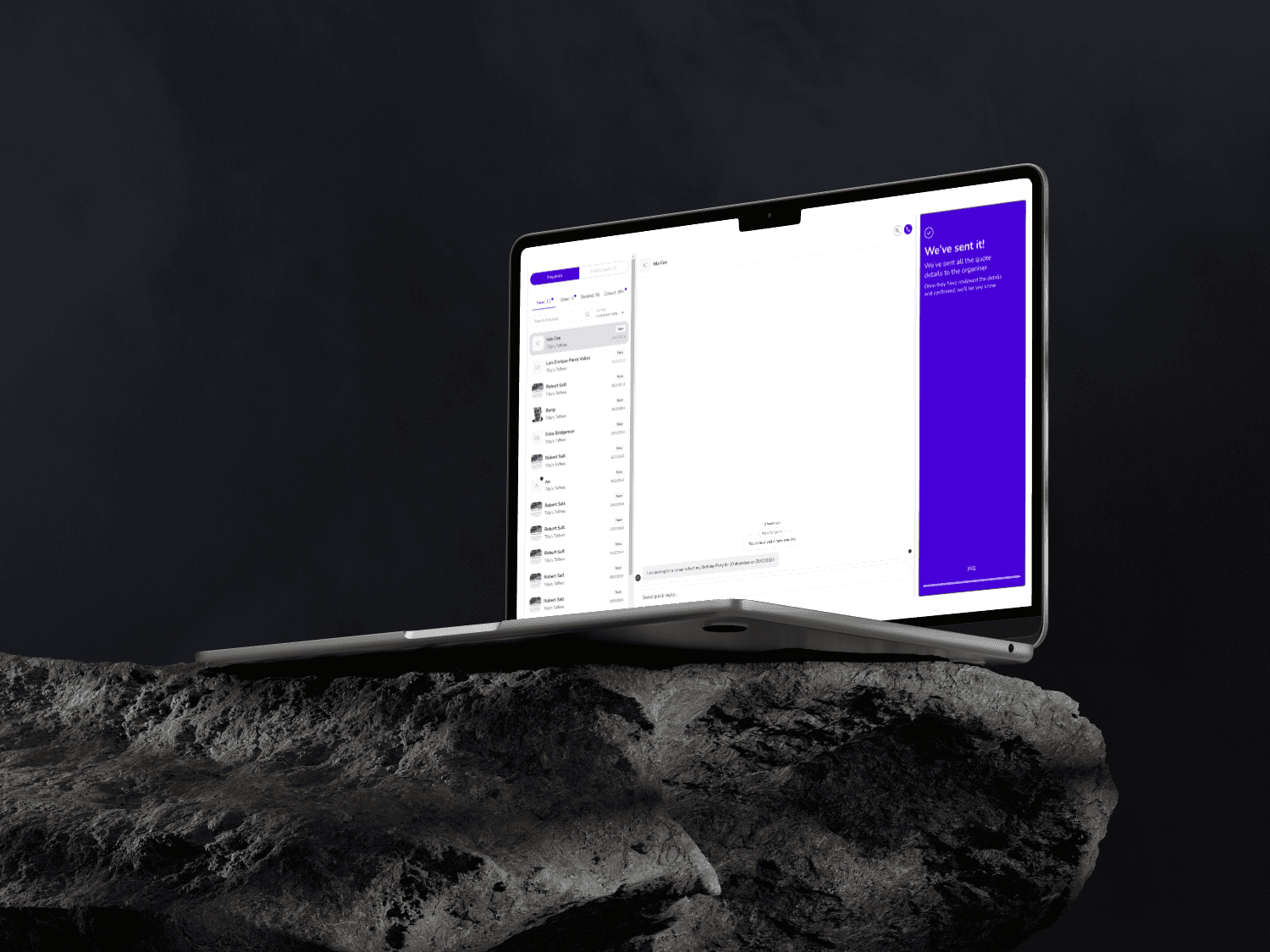
The final UI features a prominent and intuitive 'Mark as Booked' button, an efficient booking process, and 'wow' moments to delight users and help promote repeat behaviours and stickiness.
